

Yearbook Design Elements That Bring Your Theme to Life
- Sep 19, 2025
- 4 min read

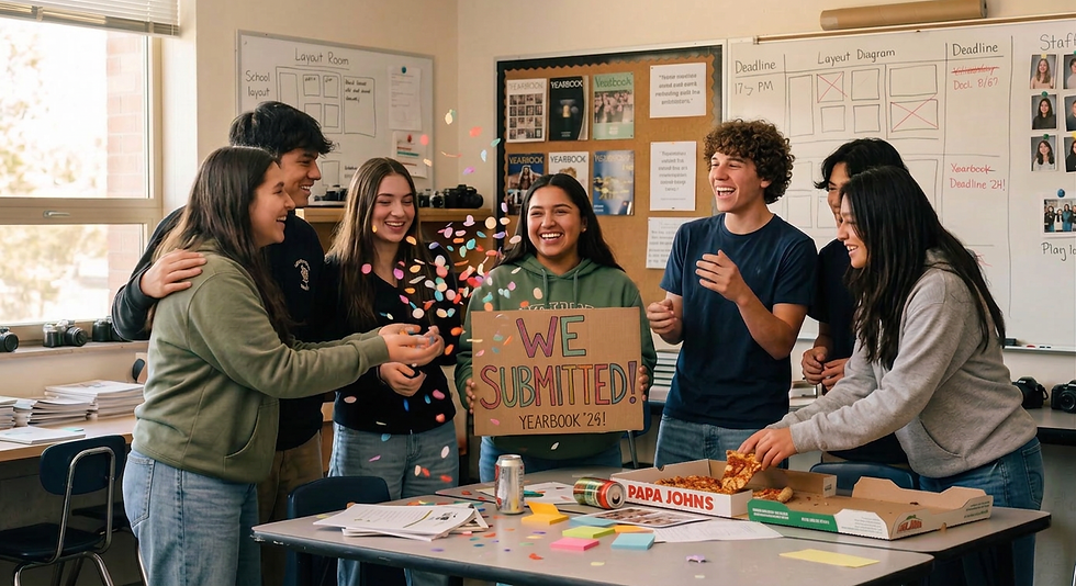
Design Elements transform your yearbook into a cohesive, professional-looking keepsake! Although selecting a theme sets the tone for your yearbook, the fonts, colors, layouts, and graphics bring your theme to life. Style guides will help maintain consistency across every spread.
Two proven approaches show how powerful style guides can be:
Hansen’s Style Guide Method encourages student creativity by having them design layouts based on the theme. Then, editors refine these ideas into two template spreads, ensuring consistency while still celebrating individuality.
The Trimmer’s Style Guide focuses on visual identity, defining approved colors, typography, and design elements upfront, so every spread feels unified and instantly recognizable.
Both guides were developed by seasoned yearbook advisers who have helped generations of students create eye-catching, professional-level layouts. By following these frameworks, students learn how to blend creativity and consistency, a skill that elevates both the book and the staff who produce it.
Together, these approaches highlight the balance between creative freedom and editorial consistency. Below, we’ll explore the key design elements you can use and how style guides help tie them together into one seamless book.
1. Typography That Speaks Volumes
Fonts shape personality. They can be playful, serious, bold, or timeless. But without structure, typography choices can quickly feel chaotic.
Headline Fonts: Choose something expressive that fits your theme (bold sans serif for modern, script for personal).
Body Fonts: Keep them simple and legible for storytelling.
Accent Fonts: Use sparingly for pull quotes or sidebars.
✨ Style Guide Tip (Trimmer’s): Define 2–3 approved fonts in your style guide so staff members stay consistent.
2. Color Palettes That Unify
Color does more than decorate; it creates mood and directs attention.
School Spirit Palette: Use core school colors with lighter/darker variations.
Minimal & Modern: Stick to neutral tones with one bold pop.
Trendy Gradients: Soft blends of purple-blue or orange-pink add modern flair.
✨ Style Guide Tip (Trimmer’s): Establish an official color palette in your yearbook style guide. This ensures every spread reinforces your visual identity.
3. Layouts That Guide the Reader
Layouts visually communicate your story. Without guidelines, pages can look mismatched.
Grid-Based Layouts: Clean, balanced, and repeatable.
Collage-Style Spreads: Impactful for candid moments and student life.
Full-Bleed Photography: Use one dramatic photo to anchor a spread.
✨ Style Guide Tip (Hansen’s): Have staff create layouts based on the theme, then refine them into two template spreads approved by editors. This provides a creative start while ensuring consistency across the book.
4. Textures & Patterns That Add Depth
Patterns prevent pages from looking flat.
Notebook & Paper Textures: Perfect for a “student life” vibe.
Geometric Patterns: Bold lines, triangles, and grids for a modern look.
Organic Elements: Watercolors or brush strokes for an artistic touch.
✨ Style Guide Tip (Hansen’s): Revise student-created designs to incorporate shared graphic elements like folios and borders for a unified feel.
5. Photo Treatments & Effects
Photos are the centerpiece of every yearbook. Use design effects to elevate your photos.
💡 Keep treatments consistent across sections to avoid visual clashes.
Black & White with Color Pop: Draws attention to a focal point.
Polaroid Frames: Adds retro scrapbook charm.
Cut-Out Silhouettes: Magazine-style cutouts layered with shapes.
6. Icons, Illustrations & Accents
The little details often tie the whole book together.
Custom Icons: Incorporate mascots or activity-specific icons.
Doodles & Stickers: Add fun, student-friendly energy.
Borders & Dividers: Clean lines or school-themed motifs keep sections organized.
✨ Style Guide Tip (Trimmer’s): Document these accents in your brand guide so they’re used consistently and not scattered randomly
Why Style Guides Matter
Both Hansen’s and Trimmer’s methods prove the same point: consistency matters.
Hansen’s method empowers creativity first, then channels it into cohesive layouts by using shared templates.
Trimmer’s style guide emphasizes visual identity, fonts, colors, and graphics to strengthen connection and professionalism.
Together, they ensure your yearbook balances student creativity with editorial consistency, resulting in a book that feels unified, polished, and memorable.
Final Thought
A theme gives direction, but it’s the design elements, typography, color, layout, texture, photos, and accents that make the book unforgettable. By pairing creativity with a clear style guide, your staff can produce a yearbook that feels cohesive, professional, and worthy of the memories it preserves.
Download both these style guides here!
Copyright © 2025. TSE Worldwide Press. All Rights Reserved.

Contributor: Jessica Carrera, Associate Editor at TSE Worldwide Press and Marketing Coordinator at United Yearbook, holds a B.A. in English with a concentration in writing from Biola University. She aspires to touch the lives of others through her words.

Editor: Donna Ladner obtained a B.A. in Education and a minor in English from California Baptist University, and a M.S. in ESL from USC, Los Angeles. After she married Daniel, their family moved to Indonesia with a non-profit organization and lived cross-culturally for 15 years before returning to the U.S in 2012. Donna has been working as an editor and proofreader for TSE Worldwide Press and its subsidiary, United Yearbook since 2015.


Comments